How to brief production-ready studio photos
Studio-grade product imagery is a briefing problem before it is a rendering problem. Here is the checklist our team uses to go from a rough garment shot to a frame that survives art direction review.

Janjan Team
Author
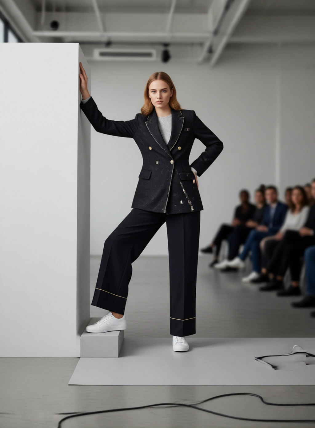
Most teams that try generative imagery for the first time judge it on the wrong thing. They upload a garment, generate a frame, and look at whether the model is beautiful. Art directors do not look at that. They look at whether the collar sits right, whether the fabric drapes the way the sample drapes, and whether the shadow under the hem matches the shadow on the wall.
Production-ready is a much narrower target than good-looking, and hitting it is mostly about the brief. This is the checklist we walk through with teams during onboarding.
Start with the garment, not the model
The single biggest predictor of a usable frame is the quality of the input you give it. A generative model can invent a plausible studio, but it cannot invent information that is not in your source photo.
Before you upload anything, check the source against these four points:
- The whole garment is visible. A cropped sleeve or a hem that runs off the edge of the frame becomes a guess. Guesses are where inconsistency comes from.
- The fabric texture is legible. If you cannot see the weave, the rib, or the pile at 100% zoom, neither can the model. Ribbed knits and technical fabrics in particular need a sharp source.
- The colour is honest. Shoot on a neutral background under even light, or correct the source before uploading. A garment photographed under warm store lighting will carry that cast into every frame you generate from it.
- Hardware and trims are in focus. Zips, eyelets, buckles and logo tabs are the details reviewers zoom into first.
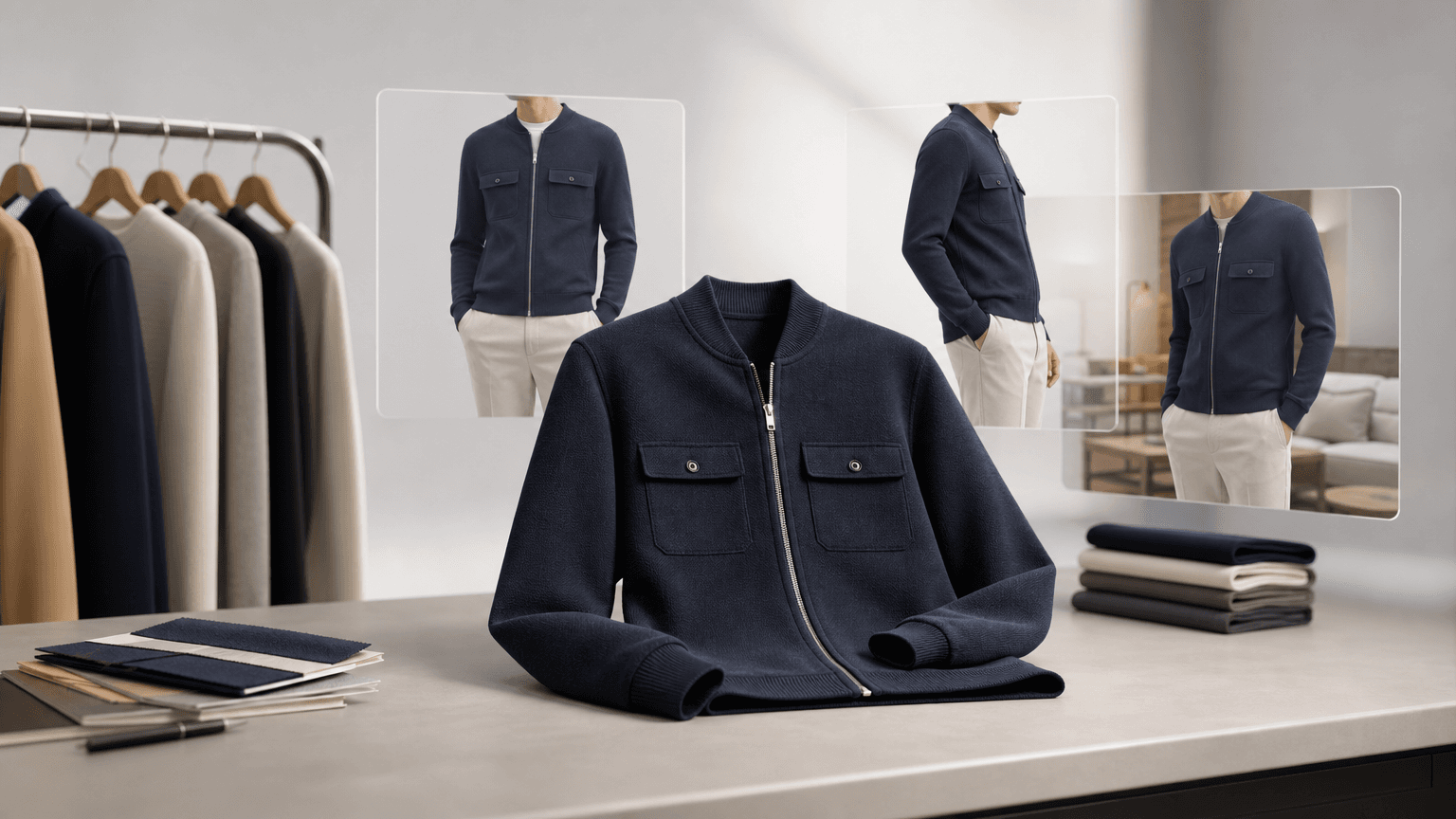
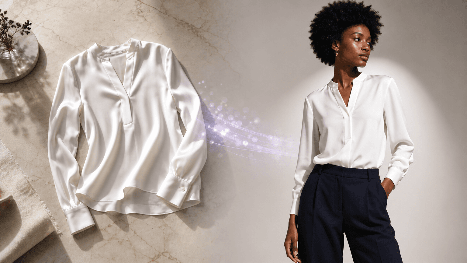
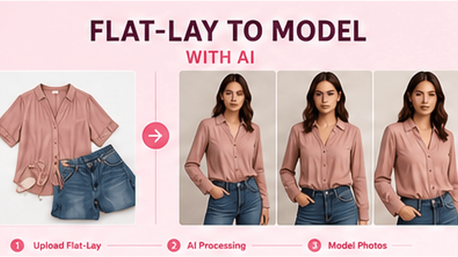
Flat-lays, mannequin shots and ghost-mannequin shots all work. What matters is that the garment is unambiguous, not that it is already styled.
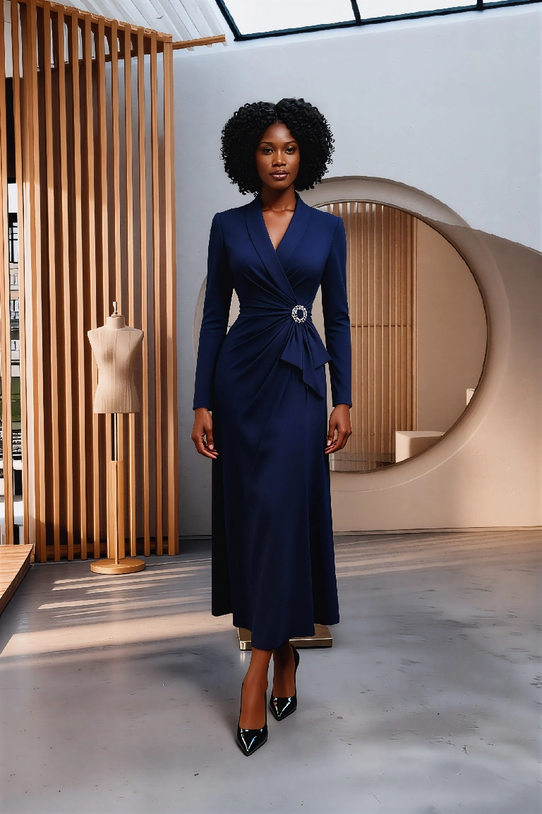
Describe light the way a photographer would
The most common briefing mistake is describing a mood instead of a setup. "Editorial and moody" gives the model nothing to work with. "Single softbox camera left, white bounce card camera right, seamless grey backdrop" gives it a scene.
A useful brief usually names four things:
- The key light — its quality (soft or hard), its direction, and roughly how high it sits.
- The fill — a bounce card, a second softbox, or nothing at all if you want deep shadows.
- The background — seamless paper, a cyclorama, a textured wall, a location.
- The camera — focal length and distance, because an 85mm portrait and a 35mm three-quarter shot flatter garments very differently.
You do not need to be exhaustive. You need to be specific enough that two people reading the brief would set up the same shot.
A worked example
Instead of:
Clean studio shot, professional, high quality
Write:
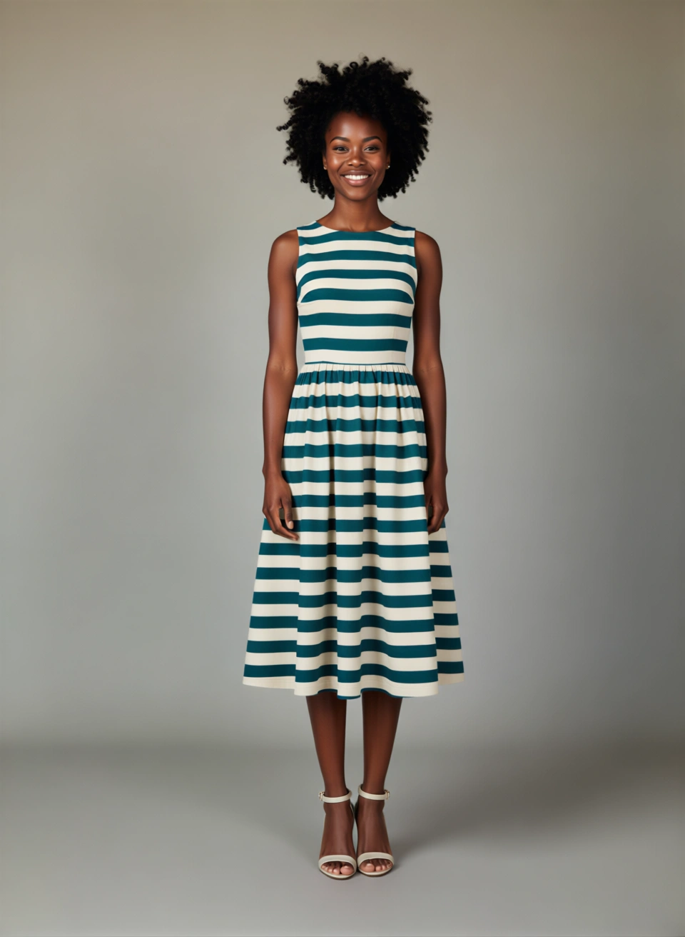
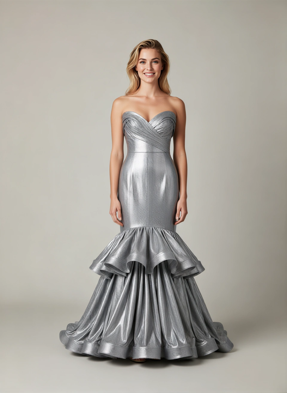
Full-length shot on light grey seamless. Large softbox camera left at 45 degrees, white bounce card camera right. 85mm lens, model standing three-quarters to camera, weight on the back foot. Soft shadow falling to the right of the model.
The second brief is not longer because it is more decorative. It is longer because every clause removes a decision the model would otherwise make for you.
Lock the frame before you lock the look
Teams often iterate on styling while the framing is still moving, which makes it impossible to tell what actually changed between two versions. Work in the other order.
Fix the framing first — full length, three-quarter, waist-up, detail crop — and only then start adjusting light, background and pose. Once the frame is stable, every subsequent change is legible, and you can build a small library of approved setups that the rest of the catalogue inherits.
This is also what makes a catalogue look like a catalogue rather than a mood board. Consistency across a product family comes from reusing a locked setup, not from finding one perfect image.
Review like a retoucher
When a frame comes back, resist the urge to judge it as a whole. Run the same pass a retoucher would:
- Silhouette. Does the garment sit on the body the way the sample sits on a fit model? Check the shoulder seam, the armhole and the hem line.
- Structure. Do collars, cuffs, plackets and pockets have the same construction as the source? Count buttons.
- Fabric behaviour. Does a stiff cotton behave like stiff cotton, or has it picked up the drape of a jersey?
- Colour. Compare against the source at 100% zoom, not from memory. Screen-to-screen colour drift is a real review problem.
- Contact shadows. Where the garment meets the body and where the model meets the floor. Missing contact shadows are the most common reason a frame reads as synthetic even when everything else is right.
- Hands and hardware. The two places where small errors are most visible at PDP zoom levels.
If a frame fails on silhouette or structure, the fix is almost always a better source image, not a better prompt. If it fails on light or shadow, the fix is in the brief.
Decide what "approved" means before you scale
The last step is organisational rather than technical. Agree, in writing, on what a frame has to satisfy to be published — and who signs it off.
For most teams that means a short spec: approved framings, approved backgrounds, a colour tolerance, and a named reviewer per product family. Without it, every image becomes a separate negotiation, and the review queue becomes the bottleneck instead of the shoot.
With it, the work becomes repeatable. You brief once, approve a setup, and apply it across a family of products — which is the point of the whole exercise.
Where to go next
If you are setting this up for a storefront, the Shopify product photography workflow post covers how these frames fit into a PDP publishing process. If you are working across a full campaign rather than a single product, consistent fashion campaign imagery covers holding a look steady across many assets.
Want a hand building the spec for your catalogue? Talk to our team — we are happy to walk through your current setup.