Keeping a campaign consistent across every asset
A campaign is not a set of images, it is a set of rules that images obey. This is how to write those rules down so a lookbook, a paid social cut and a PDP frame still look like the same season.

Janjan Team
Author
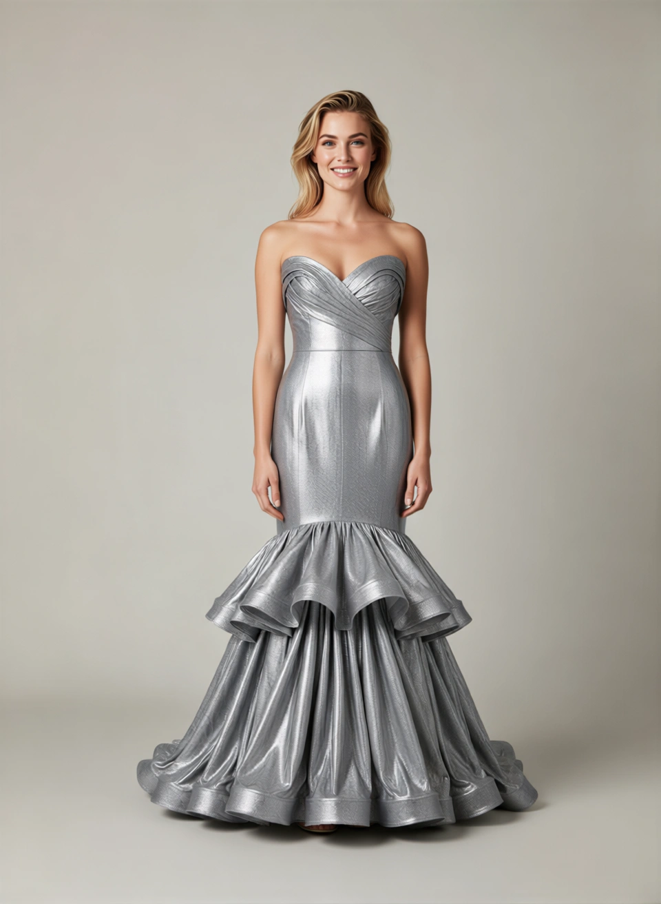
Consistency is the thing clients notice last and complain about first. Nobody opens a lookbook and says "the colour temperature is coherent". They open it, feel that it holds together, and move on. When it does not hold together, they cannot always say why — but they know.
The instinct is to solve this by finding one great reference image and asking everyone to match it. That rarely survives contact with a real campaign, because a reference image encodes dozens of decisions at once and nobody can tell which ones are load-bearing.
The alternative is to write the decisions down separately. Here is the set that does most of the work.
Separate the fixed rules from the free choices
Start by splitting your campaign into two lists: what must be identical across every asset, and what is allowed to vary.
For a typical seasonal campaign the fixed list looks like:
- Colour temperature and overall grade
- Background family — the specific paper colours, wall textures or locations in play
- Light quality — soft or hard, and roughly the same key direction
- Focal length range
- How much of the frame the garment occupies
And the free list:
- Pose
- Crop and orientation
- Which model is in frame
- Accessory styling
The value of the split is that it makes disagreements resolvable. "This one feels off" becomes "this one is graded warmer than the fixed rule", which is a specific, fixable note.
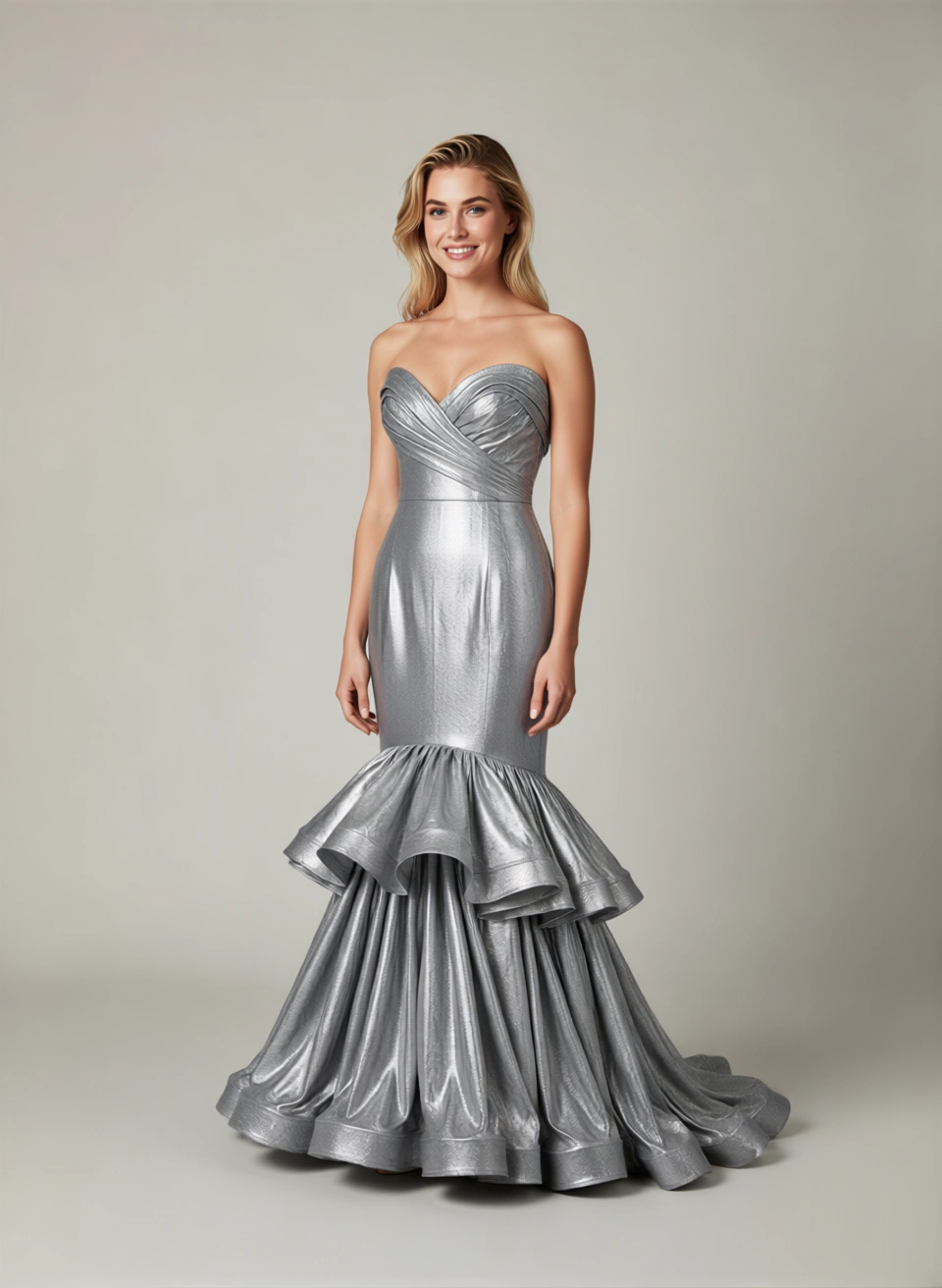
Build a reference sheet, not a reference image
Once the split exists, encode it as a small sheet rather than a single hero frame. In practice that is:
- Two or three approved backgrounds, named and with a hex or paper code.
- One or two lighting setups, described the way you would brief a photographer — key light quality and direction, fill, background separation.
- A grade reference — a small strip of three or four frames that define the target colour, so drift is judged against a range rather than one image.
- A framing chart — full length, three-quarter, waist-up, detail, with the approximate garment-to-frame ratio for each.
This sheet is the campaign. Every asset is a combination drawn from it. New assets do not need new approvals; they need to demonstrate they came from the sheet.
Cast once and reuse
Model consistency is the most visible axis and the easiest to get wrong when assets are produced in batches over several weeks.
Pick your casting at the start of the campaign and treat it as fixed. If you are working with generated characters, that means locking the character set before production rather than choosing per shot. If a new look genuinely needs a face that is not in the set, that is a campaign-level decision, not a per-asset one — it changes what the campaign looks like.
The same applies to how many characters appear. A campaign with four recurring faces reads as a campaign. A campaign with fourteen reads as a stock library.
Produce in setups, not in deliverables
The natural instinct is to work through the deliverables list: hero banner, three PDP frames, six paid social cuts, a lookbook spread. That order maximises setup switching, and every switch is where drift creeps in.
Work by setup instead. Produce everything that uses setup A, then everything that uses setup B. The deliverables get assembled at the end from a pool of consistent frames.
This has a second benefit: it makes coverage gaps obvious early. If you finish setup A and realise you have no back views, you find out while the setup is still live rather than three days later.
Review side by side, always
Consistency errors are invisible in isolation and obvious in a grid. Never approve a campaign asset on its own.
Build a contact sheet — every asset in the campaign, small, on one screen — and review from that. Colour drift, inconsistent crops, a pose that has wandered outside the free list, and a background that is not from the approved family all announce themselves immediately at that scale.
Zoom in only after the grid looks right. Detail review and consistency review are different jobs and mixing them means doing both badly.
Version the sheet, not the assets
Campaigns change mid-flight. A colourway gets cut, a location falls through, someone decides the grade is too cool. When that happens, update the reference sheet and version it, rather than patching individual assets.
Then re-run the affected setups against the new sheet. This sounds like more work than fixing the six assets someone flagged, and for six assets it is. But it keeps the sheet true — and a sheet that no longer describes the campaign is worse than no sheet at all, because people keep trusting it.
The short version
A consistent campaign comes from four habits:
- Write down what is fixed and what is free.
- Encode the fixed part as a reference sheet, not a hero image.
- Lock casting and produce by setup rather than by deliverable.
- Review as a grid, and version the sheet when the campaign moves.
None of this is specific to how the images are made. It applies to a location shoot, a studio day, or a generated set — which is precisely why it is worth writing down once and reusing every season.
For the frame-level craft that feeds into this, see how to brief production-ready studio photos. For getting the results onto a storefront, see a Shopify product photography workflow that scales.